Get More Customers
How Gyms Get More Members From Their Website
Someone is standing outside your gym right now.
They're on their phone. They just searched "gym near me."
How gyms get more members from their website comes down to what happens in the next ten seconds — before they ever talk to a person.
If your site loads slow, hides your prices, or shows stock photos of people who don't train there, they close the tab and try the next result.
If it shows real classes, real pricing, and one clear way to book a free trial — they walk in.
Here's how to build the second version.
The "gym near me" search that decides everything
Most new members don't find you through a referral or a flyer anymore.
They find you the way they find everything else — a phone search, done in seconds, often while standing right outside a gym deciding whether to walk in.
That means two searches matter more than any other:
- "Gym near me" — the broad, decide-right-now search.
- Class-specific searches — "yoga classes near me," "CrossFit near me," "24 hour gym near me."
If your website never mentions the classes you actually run, you won't show up for the second kind at all.
Your homepage and class pages should say the words a real prospect types — your city, your neighborhood, and the specific classes and formats you offer. Not just "fitness studio." Say "HIIT," "spin," "strength training," "beginner-friendly," whatever is true for you.
This is the same gap that shows up across almost every local business — why customers can't find you online is rarely about quality. It's about whether your site says what people are searching for, in their words, not yours.
Stop hiding your pricing behind "Contact Us"
Here's a pattern worth killing today: a gym website with beautiful photos, a class list — and a "Contact Us for Pricing" button where the price should be.
Hidden pricing is one of the biggest reasons prospects bounce before they ever book a tour.
Think about it from their side. They're comparing three or four gyms in their area. Two show a clear monthly rate. One makes them fill out a form and wait for a callback.
Which one gets crossed off the list first?
People want to know the cost before they'll commit to a tour. Not after. Making them ask feels like a sales trap — and most people would rather avoid the trap than risk it.
That doesn't mean you have to publish every tier down to the cent. But show something:
- Starting monthly rate, or a clear range.
- What's included — classes, open gym, equipment, guest passes.
- Any joining fee, stated up front, not discovered at checkout.
Clarity here doesn't lose you leverage. It filters in the people who are already sold on the price — and lets you spend your sales energy on the ones who still have real questions.
Make "book a free trial" the easiest thing on the page
If pricing answers "can I afford this," the free trial answers "can I trust this enough to try it."
A free trial class or a free day pass is the lowest-risk way for a stranger to become a member. It should be the most obvious button on your entire site.
Not buried in a "Membership" dropdown. Not three clicks deep. Front and center, above the fold, on every page.
A few things that make this path frictionless:
- One clear CTA — "Book a Free Trial Class" or "Claim Your Free Day Pass" — not five competing buttons.
- A real time picker, not just a phone number to call during business hours.
- No account creation required to just see availability.
- A confirmation that sets expectations — what to wear, where to park, who to ask for.
The gym that makes it easiest to say yes to a free trial gets the most people through the door — not the gym with the fanciest website.
This same logic holds across service businesses — how chiropractors get more patients leans on the exact same idea: reduce the first ask to something tiny and specific, and conversion goes up.
Stock photos are a red flag, not a selling point
People can tell.
Curious what a gym website like this looks like for you?
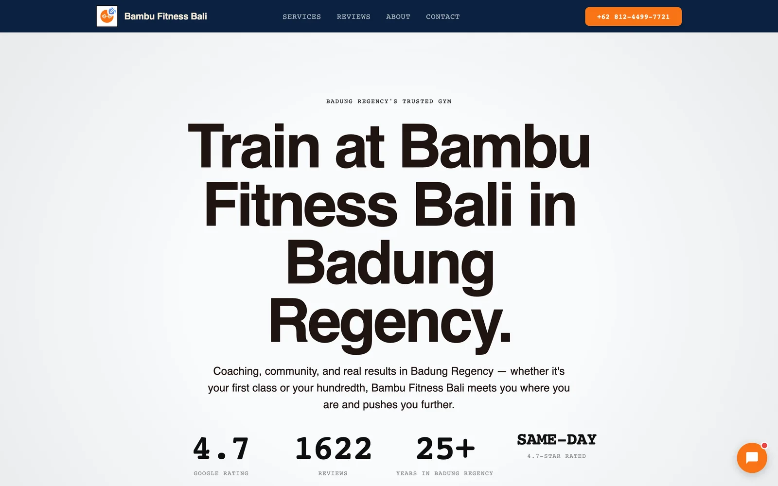
Neuro built Bambu Fitness Bali's site from their own Google data — yours can be next, in about 60 seconds.
Build my demo in 60 seconds →

A stock photo of a model doing a perfect deadlift in a gym that isn't yours doesn't build trust. It quietly signals the opposite — that what you're about to see isn't real.
Real photos of your actual space and your actual members do more selling than any headline can.
That means:
- Your real equipment floor, not a stock rack shot.
- Your real classes in session, with real members' faces (with permission).
- Your instructors, named, so a prospect can picture who'll greet them on day one.
If your gym has a distinct feel — small and community-driven, big and high-energy, quiet and equipment-focused — photos are the fastest way to communicate that before a single word is read.
Reviews and transformation stories are your trust engine
A prospect who's never set foot in your gym has one question underneath everything else: "Will this actually work for someone like me?"
Reviews and transformation stories answer that better than any feature list.
A few ways to use them well:
- Put reviews near the decision, not buried on a separate page. Right next to your pricing or your trial CTA is ideal.
- Feature a few real transformation stories — before/after, or just a member describing what changed for them. Specifics beat generic praise ("lost the weight I'd tried to lose for years" beats "great gym!").
- Show variety. A beginner's story, a competitive athlete's story, a busy parent's story — so more visitors see themselves in one of them.
This works the same way it does in any trust-driven local business — how plumbers get more customers leans on the exact same review-first logic, because a stranger deciding whether to let someone into their home isn't so different from a stranger deciding whether to walk into your gym.
Build for the phone — because that's where the decision happens
Here's the detail that changes everything else on this list: most "gym near me" searches happen on a phone, and a large share of those happen while someone is standing right outside your building, deciding in real time.
That means your site's mobile experience isn't a nice-to-have. It's the main event.
A mobile-first gym site should have:
- A pricing and trial CTA visible without scrolling — not buried under a hero image and three paragraphs.
- Tap-to-call and tap-to-book buttons, not a phone number you have to copy and paste.
- Fast load times. Someone standing on a sidewalk with one bar of signal will not wait for a slow page.
- A class schedule that's actually readable on a small screen — not a desktop table shrunk down until it's unreadable.
If your desktop site looks great but your mobile site is an afterthought, you're losing the exact moment that matters most — someone standing outside, phone in hand, deciding whether to walk in or walk on.
What this looks like on a real gym website
All of this is easier to see than to describe.
Bambu Fitness Bali is a live example — a real gym's website built from its own classes, its own photos, and its own reviews, with a free-trial booking path placed front and center instead of buried behind a contact form.
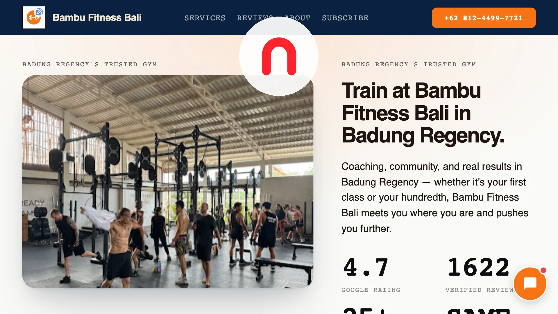
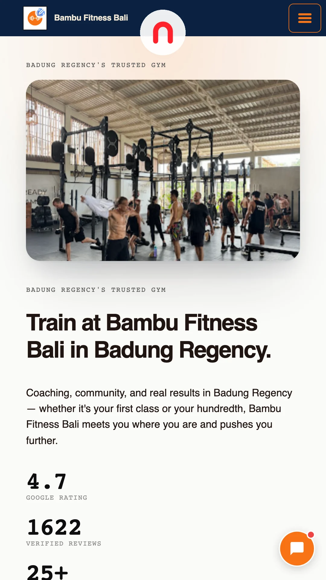
No stock photography. No pricing hidden behind a form. Just the gym's own classes, its own space, and its own members, laid out so a prospect can decide in seconds instead of guessing.
If you want to see how other gyms and fitness studios have approached the same problem, browse more real examples in the showcase.
Frequently asked questions
Should a gym website show exact pricing, or just a starting rate?
What's the single highest-impact change a gym can make to its website?
Do class schedules need to be on the homepage?
How important are reviews compared to photos?
Why does mobile design matter so much for gyms specifically?
Does a gym need a custom-built website, or can a template work?
See what Neuro would build for you
Build your demo from your own data in about 60 seconds — then watch your AI team take it live and grow it.
See a real gym example: Bambu Fitness Bali
Build my demo in 60 seconds → Explore the showcaseWant Neuro running this for you every week? See Apex Concierge — from $119/mo →