Get More Customers
7 Restaurant Website Mistakes That Cost You Reservations
The most common restaurant website mistakes all do the same thing.
They make a hungry person work harder than they should — right when you had them.
A diner finds you on Google. They're hungry, they're on their phone, and they're deciding fast.
One extra tap, one blurry photo, one PDF that won't load — and they're back on the map, tapping the next pin.
That's not a marketing problem. That's a reservation you just lost.
Here are the seven mistakes that cause it — and how to fix each one.
Mistake #1: Your menu is a PDF or a photo, not real text
You uploaded a scan of your printed menu. Or a photo of it. Or a PDF export from your design software.
Here's the problem: none of that is text a phone — or Google — can read.
A diner has to pinch, zoom, and scroll sideways just to see if you have anything gluten-free. On a small screen, in bad lighting, at a stoplight, most people give up before they finish scrolling.
And Google can't read it either. A PDF menu means your dishes, your prices, and your specials are invisible to search — so you don't show up when someone searches "restaurants with vegan options near me."
The fix: put your menu on the page as actual HTML text. Real headings for each section (appetizers, entrees, desserts), real line items, real prices. It should be readable without zooming, and it should be copy-pasteable — because if you can copy it, so can Google.
Mistake #2: No easy way to book or call
Your hours are listed. Your menu looks great. And then the diner wants to actually reserve a table — and there's nothing to click.
Maybe there's a phone number buried in a paragraph. Maybe "reservations" is a mailto link to an email nobody checks.
A diner who can't book in one tap will book somewhere else. They're not going to type out your number, dial it, wait on hold, or write an email and wait for a reply. They'll hit back and pick the next result.
The fix: put a tap-to-call button and a booking link — even something as simple as a link to your OpenTable or Resy page — in the header, and repeat it near the top of the page. Make the path from "I'm hungry" to "I have a table" as short as physically possible.
Mistake #3: Hours or location are wrong, outdated, or hard to find
Nothing kills trust faster than showing up to a restaurant that's closed.
Maybe your hours changed for the new season and the website still says the old schedule. Maybe the address only lives in a contact page three clicks deep. Maybe there's no map at all.
So the diner does the thing you don't want: they leave your site and go check Google Maps to be sure. Every one of those extra checks is a chance they land on a competitor's listing instead — and forget to come back.
The fix: hours and address belong in the same place on every page — usually the header or footer — pulled straight from your Google Business Profile so they're never out of sync. Add a real embedded map, not just an address in text.
Mistake #4: No real photos of your food or your space
Stock photography is easy to spot. And once a diner spots it, they stop trusting everything else on the page.
Curious what a restaurant website like this looks like for you?
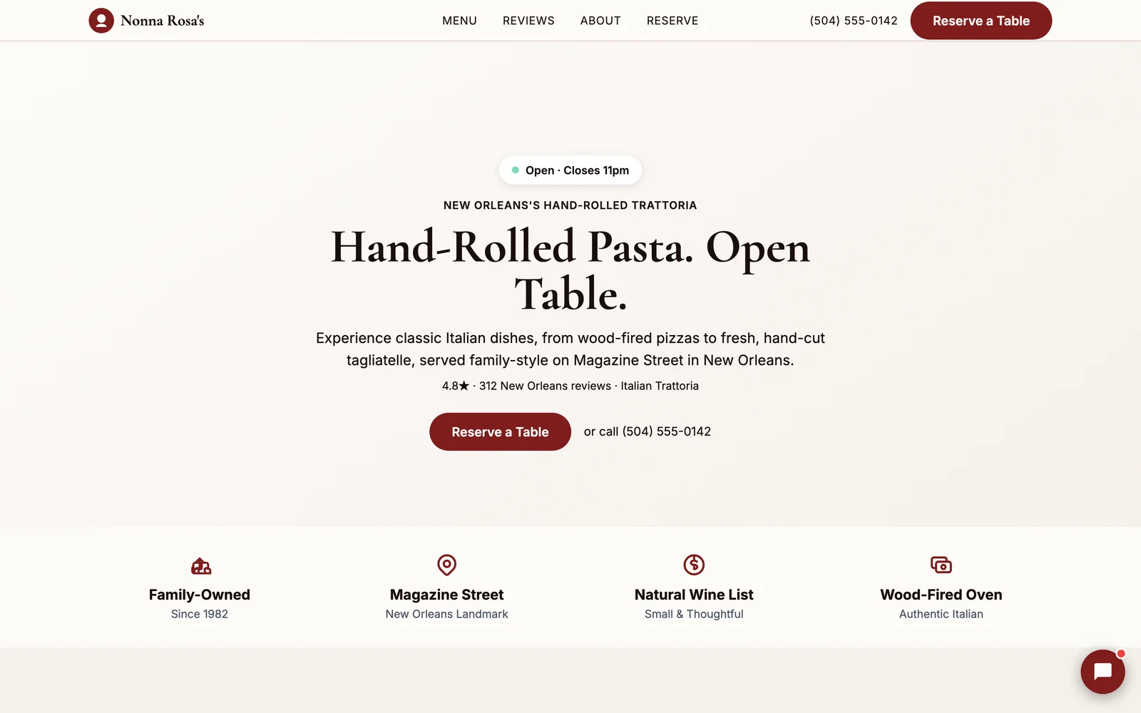
Neuro built Nonna Rosa's Trattoria's site from their own Google data — yours can be next, in about 60 seconds.
Build my demo in 60 seconds →

A generic photo of pasta that isn't your pasta tells the diner one thing: you didn't bother to show them what they're actually getting. And food is a visual decision — people decide what to eat with their eyes before they ever taste it.
The fix: use real photos of your actual dishes, your dining room, your bar. Even a handful of good phone photos taken in natural light beats a library of polished stock shots. If you're precious about photo quality, ask your best regulars to send a few from a great meal — real is more convincing than perfect.
Mistake #5: The site is slow on mobile
Most restaurant searches happen on a phone, and a lot of them happen when the person is already hungry and already a little impatient.
A restaurant website loaded with huge unoptimized images, heavy plugins, or one of those auto-playing hero videos is asking someone with a growling stomach to sit and wait. They won't.
The same booking-friction problem shows up for real estate agents trying to get more leads — a slow site loses the click before the pitch even starts.
The fix: compress your images, cut anything that isn't earning its place on the page, and test your site on your own phone, on regular cell service, not fast office WiFi. If it feels slow to you, it's worse for someone standing outside in the sun trying to decide where to eat.
Mistake #6: Reviews are ignored or hidden
You've got great reviews on Google. A diner deciding between you and the place next door is going to go looking for social proof — and if your website doesn't show any, they'll go find it somewhere else, which means leaving your site.
Worse: if you never reply to reviews, especially the critical ones, it signals nobody's home.
The fix: feature real reviews on the homepage, not buried on a "testimonials" page nobody clicks. Link out to your full Google reviews. And reply to reviews — good and bad — so it's obvious a real person runs this restaurant.
Mistake #7: No clear signal of cuisine, price, or vibe up front
A diner scanning search results decides in seconds whether to click, and clicks in seconds whether to stay.
If your homepage opens with a vague hero image and no sense of what kind of place this is — casual or fine dining, cheap eats or date night, Italian or fusion — you've made them guess. People don't stick around to guess. They bounce back to the search results and try the next name instead.
The same first-impression problem trips up service businesses too — see how it plays out for dental practices trying to get more patients from their website.
The fix: say what you are, plainly, above the fold. Cuisine, rough price range, and vibe — in the headline or the first line a visitor reads. Let them self-select in three seconds instead of scrolling to figure it out.
What fixing all seven actually looks like
It's easier to see this fixed than described.
Neuro built a demo restaurant site for Nonna Rosa's Trattoria, an Italian restaurant, straight from its real menu, real photos, and real reviews — with a reservation and call path front and center on every screen.
See the live Nonna Rosa's Trattoria demo → — or browse more real Neuro sites in the showcase.
No PDF menu, no stock photography, no guessing what kind of restaurant it is. Just the real business, laid out so a hungry person on a phone can decide fast.
Whether you build that yourself, hand it to a developer, or let Neuro generate the first draft from your Google profile, the seven fixes above are the same either way — and this is a good, honest benchmark for what "fixed" should look like.
If a lot of this sounds broad and not restaurant-specific, that's on purpose — it's the same core problem covered in why customers can't find you online, just applied to a dining room instead of a storefront.
Curious how restaurants in a specific city are actually doing online? We scored a real sample: the best website for restaurants in Kissimmee, FL.
Frequently asked questions
Why is a PDF menu bad for a restaurant website?
Do I need an online reservation system, or is a phone number enough?
How many photos does a restaurant website actually need?
Should I show my Google reviews on my own website too?
What's the fastest way to fix a slow-loading restaurant site?
Can Neuro build a restaurant website like the Nonna Rosa's Trattoria example?
See what Neuro would build for you
Build your demo from your own data in about 60 seconds — then watch your AI team take it live and grow it.
See a real restaurant example: Nonna Rosa's Trattoria
Build my demo in 60 seconds → Explore the showcaseJust need the website itself — no ongoing marketing? See Essential — $39/year →