Getting Found
What Every Local Business Website Needs to Win Customers
What makes a good small business website?
It's not the fonts. It's not the animations.
It's whether a stranger, on their phone, can tell what you do, where you are, and what to do next — in about three seconds.
Miss that, and nothing else on the page matters.
Here's the good news.
You don't need a redesign to fix most of this.
You need a checklist — and ten honest minutes looking at your own site the way a stranger would.
Let's build that checklist.
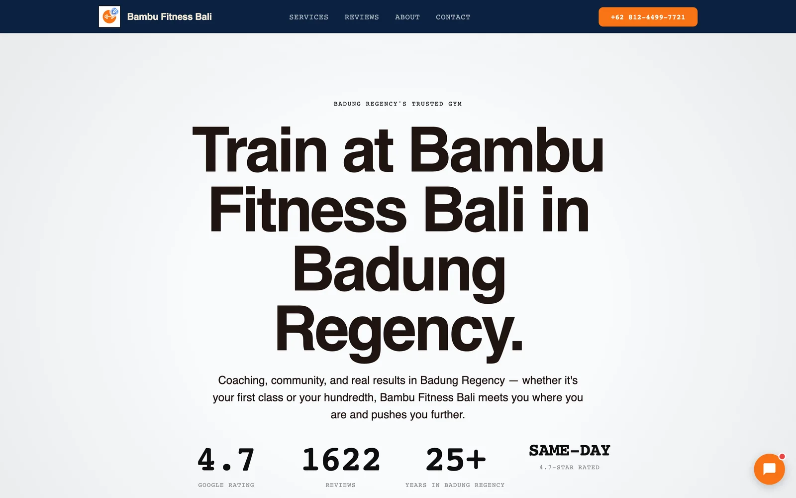
1. Say what you do and where — above the fold
Open your homepage on your phone right now.
Before you scroll, can you see:
- What the business does?
- What city or neighborhood it serves?
- Some way to take action?
If you have to scroll to find any of those, you've already lost people.
Here's why this matters more than it used to.
Most local searches happen on a phone, mid-errand, comparing three tabs at once.
Nobody scrolls a stranger's site to go hunting for basics.
They bounce to the next result instead.
The fix is almost always subtraction, not addition.
Pull your headline, your city, and your main action to the very top — before the slideshow, before the mission statement, before the "welcome to our website" copy nobody reads.
Say the plain thing first. Decorate later.
2. Show real trust signals, not stock photos
Trust is the whole game for a local business.
A stranger has never met you. They're deciding whether to hand you their money, their car, their kid, or their smile — based on a webpage.
Stock photography quietly kills that trust.
People have seen that same smiling "dentist" and "handyman" a thousand times on other sites. It reads as generic even when nobody consciously clocks why.
What actually builds trust:
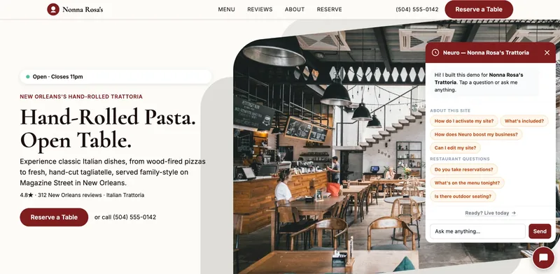
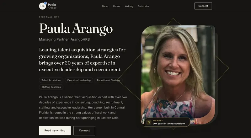
- Real photos — your team, your space, your actual work.
- Real reviews — pulled in, not paraphrased, with names attached.
- Real credentials — licenses, certifications, years in business, association memberships.
- A star rating near the top, not buried on a separate page.
Run this test: does your homepage look like it could belong to any business in your category, in any city?
If yes, that's the stock-photo problem, even if the photos are technically real.
Swap in specifics. A specific photo of your actual storefront beats a beautiful photo of someone else's.
3. Give visitors one obvious next step per page
Here's a mistake almost every local business site makes.
Too many buttons, competing for attention.
Call us. Book online. Email us. Follow us on Instagram. Sign up for a newsletter. Get a quote. All on the same page, all the same size.
When everything is emphasized, nothing is.
A visitor who's ready to act shouldn't have to decide which button is the "real" one.
Pick one primary action per page — call, book, or message — and make it impossible to miss.
Everything else can still exist. It just doesn't compete for the same visual weight.
A good test: cover the page with your hand and reveal it slowly. The first thing you see should be the one thing you want them to do.
4. Build for mobile first, and make it fast
This isn't a nice-to-have anymore.
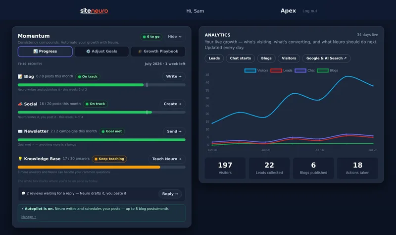
Your growth partner
A website is the start. Neuro keeps it working.
- Built from your Google or LinkedIn
- Answers visitors, captures leads
- Drafts blog, social and newsletter
- Nothing goes out until you approve it
Most people searching for a local business — "plumber near me," "dentist open today" — are doing it on a phone, often standing up, often in a hurry.
If your site was designed on a desktop monitor and just "also works" on mobile, it's backwards.
Check these on your own phone:
- Does the page load in a couple seconds, not ten?
- Is the main button reachable with a thumb, without a stretch or a zoom?
- Does text stay readable without pinching to zoom?
- Do forms use large, tappable fields — not tiny desktop inputs?
A slow, cramped mobile site doesn't just annoy people.
It teaches them, in the first two seconds, that the business behind it might be just as hard to deal with.
Fast and simple is the professional impression. It doesn't need to be flashy to do that job.
5. Structure your services and location so machines can read them, too
This one's newer, and most local sites aren't built for it.
People don't only search on Google anymore. They ask AI assistants directly — "who does the best patio repairs near me," "which gym has classes on weekends" — and get a direct answer, no clicking required.
For an AI (or Google) to hand your business over as that answer, it needs to be able to tell, clearly:
- What service you offer, in plain language.
- What area you serve.
- That you're a real, current, operating business — hours, address, and contact info that match everywhere they appear.
A page full of vague marketing language — "excellence in service since day one" — gives a machine nothing to point to.
A page that plainly states the service and the city gives it everything.
You don't need to write for robots instead of people. You need to write plainly enough that both can follow it.
6. Keep it current — an abandoned site undermines a thriving business
Here's a strange but common gap.
The business is doing great. Busy, booked out, five-star reviews rolling in.
And the website still lists last year's hours, an old promotion, or a "coming soon" page from two seasons ago.
A stale site reads as a stale business — even when the opposite is true.
Visitors have no way to know you're thriving unless the site tells them. All they see is the date on your last blog post, the outdated hours, the broken "book now" link nobody noticed.
Quick self-check:
- Are your hours, prices, and services accurate today?
- Is there anything dated — a promo, an announcement — that's clearly expired?
- When did you last actually look at your own homepage as a visitor would?
You don't need constant updates. You need the basics to always be true.
Put it together: a five-minute self-audit
Run through this on your own site right now, on your phone:
- Above the fold — can you tell what it is, where it is, and what to do, without scrolling?
- Trust — real photos, real reviews, real credentials — or stock and vague claims?
- One action — one clear next step per page, or five competing buttons?
- Mobile speed — fast, thumb-friendly, readable without zooming?
- Clear structure — service and location stated plainly, or buried in marketing language?
- Current — hours, prices, and promos accurate today?
Score yourself honestly. Most local sites fail two or three of these, not all six — which is exactly why small fixes tend to move the needle fast.
Want to see this checklist applied to specific industries? It plays out a little differently depending on what you do — see how it looks for dental practices, plumbers, and gyms.
And if you're not sure whether the problem is your site at all, start with why customers can't find you online — it covers the layer before this one: getting found in the first place.
You can also see these principles applied across real examples if you want to look at working sites instead of a checklist.
Frequently asked questions
What makes a good small business website?
Do I need a website if I already have good reviews on Google?
How many photos does my website actually need?
Should every page have a "book now" and "call us" button?
How do I know if my site is too slow?
Is this checklist something I have to manage myself?
Ready to put this to work?
Pick how much help you want. Both start with a free look at your site.
Essential $39/year
Just the website, done properly.
- Built from your Google or LinkedIn
- Set up for Google and AI search
- Hosting and security included
- Unlimited edits, no extra cost
Apex Concierge $119/mo
Your website, plus a growth team every week.
- Your site in your inbox within 2 hours
- 30-minute setup call with a specialist
- Answers visitors, captures leads
- Drafts blog, social and newsletter